
Appearance
What you get on day one: the app dashboard
The moment a new app is created, it already has a home screen — before a single field exists.
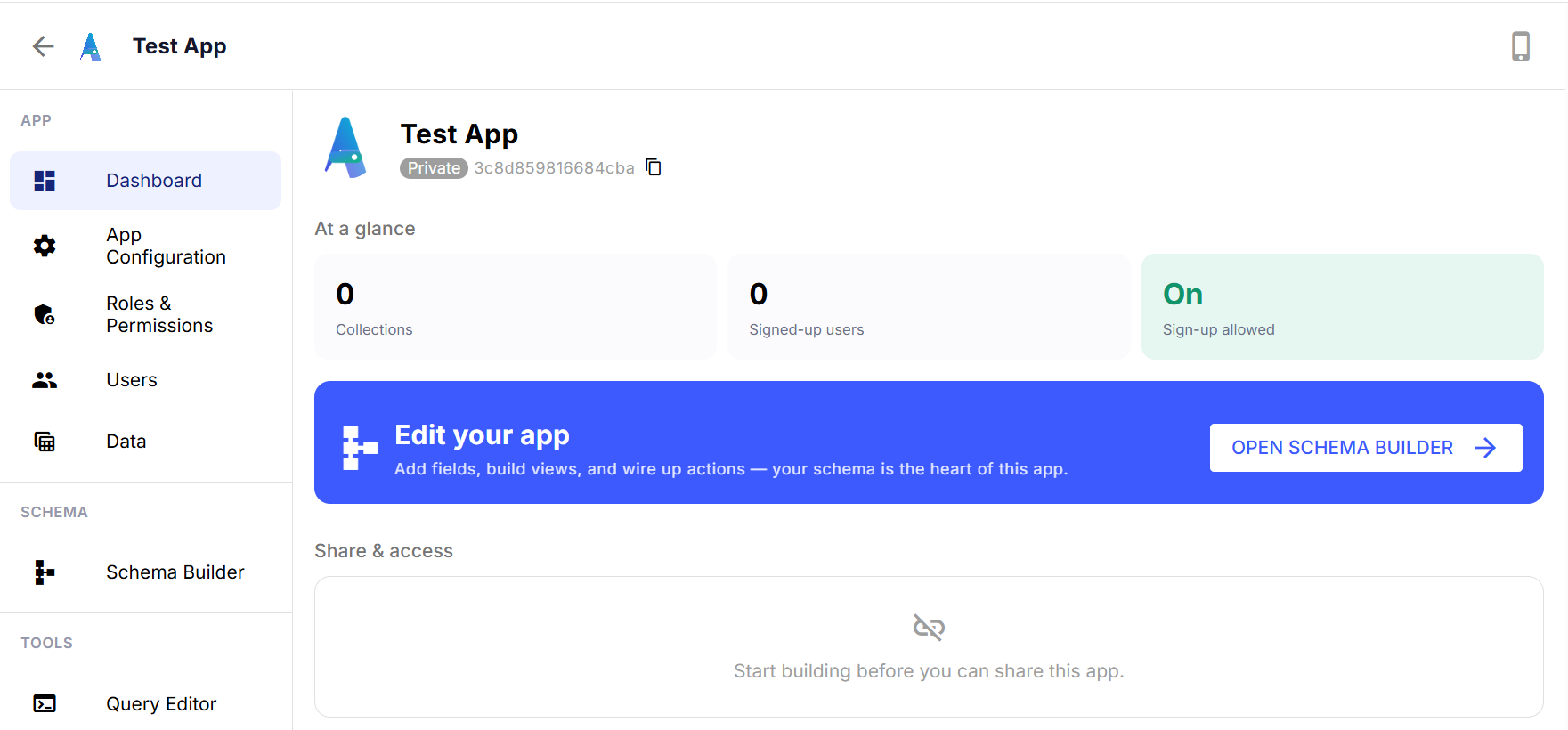
The At a glance row is deliberately small: how many collections you've defined, how many people have signed up, and whether sign-up is currently open. Three numbers, no digging required. It's the kind of thing you check in passing — "did anyone sign up overnight?" — not something you'd build a whole page to find.
Below that is a straight line to the next real step: Edit your app, which drops you into the Schema Builder — the place where fields, views, and actions actually get built. New apps start with zero collections on purpose. There's no default structure being forced on you; the dashboard just makes it obvious where to go build one.
The Share & access panel underneath stays empty until there's something worth sharing. Once your app has at least one collection your team can use, this is where you'd manage who gets in.
None of this is complicated on its own — that's the point. A dashboard for an app that doesn't have data yet shouldn't try to look busy. It should tell you exactly one thing: here's where you left off, and here's where to go next.